TechRadar Verdict
Moto 360 is Android Wear's first head-turning smartwatch backed by Google's intelligent software. It has practical information on the virtual dial, but terrible battery life and a slow processor beneath its circular screen.
Pros
- +
Stylish circular design
- +
Great build quality
- +
Affordable price
- +
Wireless charging
Cons
- -
Battery life is poor
- -
Inefficient processor
- -
Few default faces
Why you can trust TechRadar
Update: The Android Wear 2.0 update has landed for the Moto 360 (2015) and unfortunately, Google has skipped over its debut smartwatch. So, if you're still on the sidelines, the original Moto 360 is tough to recommend given the second generation can be had at a fair price.
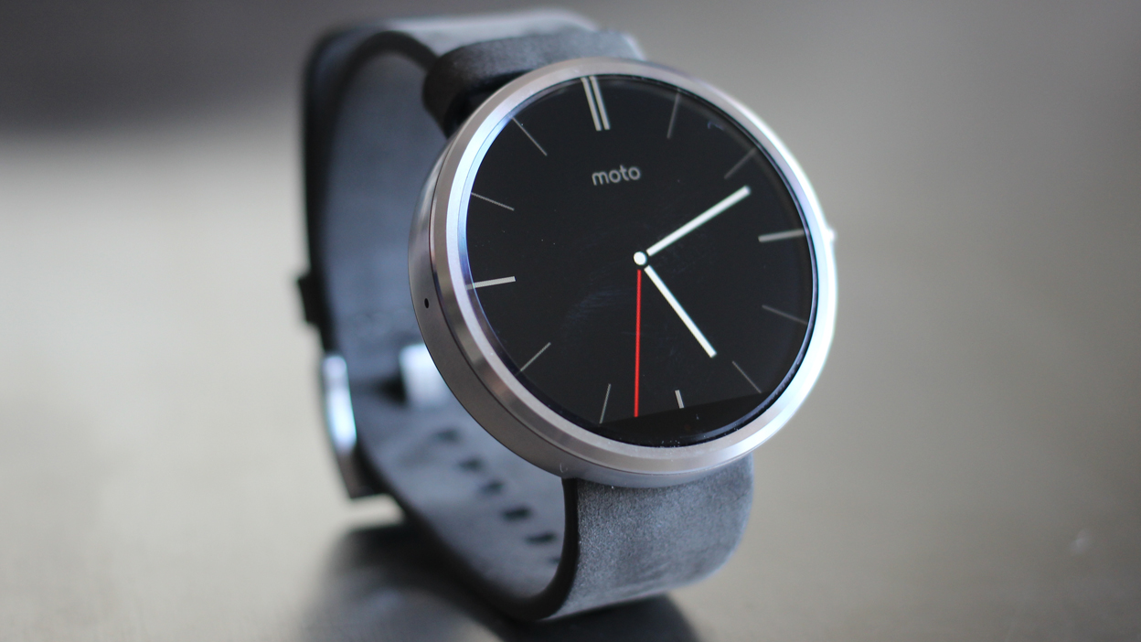
Moto 360 proves that smartwatches can be as fashionable as its Google Now-integrated software is functional, making it the first Android Wear watch worth strapping to your wrist.
Its circular watch face takes cues from stylish designer wristwatches with analog tickers, not square-shaped smartwatches. The very computerized-looking Pebble Steel, Samsung Gear Live and LG G Watch are no match for what Motorola had up its sleeve.
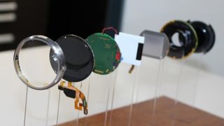
There's a certain beauty to outer Moto 360 build quality too, not just its form. Its stainless steel housing and genuine leather default wristband make it appropriate for almost any occasion. It's enough to make it rank second in our best smartwatch list.
The specs on the inside, however, do leave the smartwatch feeling a little hollow. Poor battery life and an underperforming processor don't do Moto 360's good looks justice. The watch's charm is shortened by its lack of longevity, but Motorola clearly shaped a winner that's more ambitious looking than the overly boxy Apple Watch.
Release date and price
Moto 360 launched in the US on September 5, and it's currently on sale (but sold out) at select UK stores while on pre-order at others. Expect it to ship again with a late October release date from O2, Clove, Amazon, John Lewis and Tesco. In Australia, it's still on track for the vague fourth quarter.
The Moto 360 price in the US and UK is on par with its all-metal construction and leather strap. It costs a reasonable $250 (£200, likely AU$275). That's $100 cheaper vs the entry-level Apple Watch.
That's only a little more expensive than the extremely limited Android Wear smartwatch pickings from Samsung and LG, none of which can compare to Motorola's stylish design. Moto 360 may be cheaper than rival round smartwatch competitor LG G Watch R too, so it's reasonably priced.
Display
There are few sharp-edged downsides to the Moto 360, and none of them can be found on its round, 1.56-inch LCD display. In fact, Motorola's enterprising circular screen is so attractive it instantly became the antithesis of the "smartwatches look like a miniaturized cell phone worn on your wrist" argument when Google first announced Android Wear in March.
Complimenting this traditional watch appearance is Moto 360's always-on screen. It tells the time even when its backlit LCD kicks into a power-saving dimmed display mode. It shares this feature with the Samsung Gear Live and LG G Watch along with Gorilla Glass 3 protection. All three watches remained scratch-free during our week-long testing periods.
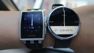
Moto 360 further draws circles around its competition with an ambient light sensor that automatically adjusts the LCD brightness. It's especially convenient when you need a bright screen in sunny conditions or want to reduce battery life consumption in dark environments without having to manually adjust the setting. Walking and fiddling with a tiny touchscreen you can't even see outside is a wearables world problem that Moto 360 solves. Pebble has this bonus feature sans a color-rich screen, while the colorful Galaxy Gear and G Watch do not.
This does mean that the Moto 360 LCD isn't a full circle. Its ambient light sensor and display drivers are housed inside a blank horizon line that sits at the bottom of the watch face. While the black bar doesn't ruin the analog watch experience, the screen is cut off and it has allowed the LG G Watch R to tout itself as the first "full circle" Android Wear smartwatch. LG is hiding the components inside the outer bezel, masked with second-hand tick marks, while Motorola chose to extend the screen pixels to the edge. It's really a matter of preference.
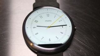
Filling that nearly perfect circle is 205 pixels per inch with a 320 x 290 resolution. That's roughly the same resolution as the smaller Gear Live but fewer pixels vs Samsung's 278ppi. Doing the math, this means Moto 360's bigger LCD has stretched pixels and there's a noticeable "screen door effect" in a side-by-side comparison. Moto 360 also forgoes a fancy OLED screen like Samsung's smartwatches and sapphire glass like the forthcoming Apple Watch. But it's a better trade-off given the on-point price.
Hands and wrists down, Moto 360 has the best-looking smartwatch design thanks to its circular display that other smartwatches are clearly looking to mimic.
